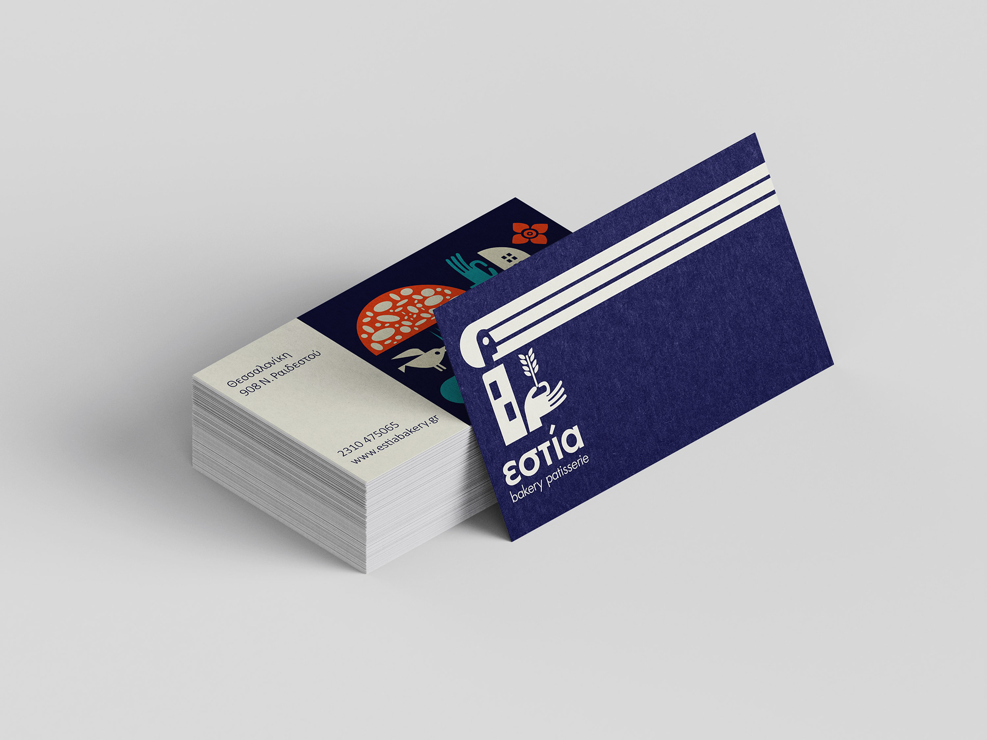
Logo and brand identity for the bakery 'Estia'.
A modern approach designed with simple geometric shapes.
The logo's design draws inspiration from the bakery's name, "Estia," which originates from the Greek goddess Hestia, known for her association with domesticity, family, and home.
The logo's design draws inspiration from the bakery's name, "Estia," which originates from the Greek goddess Hestia, known for her association with domesticity, family, and home.
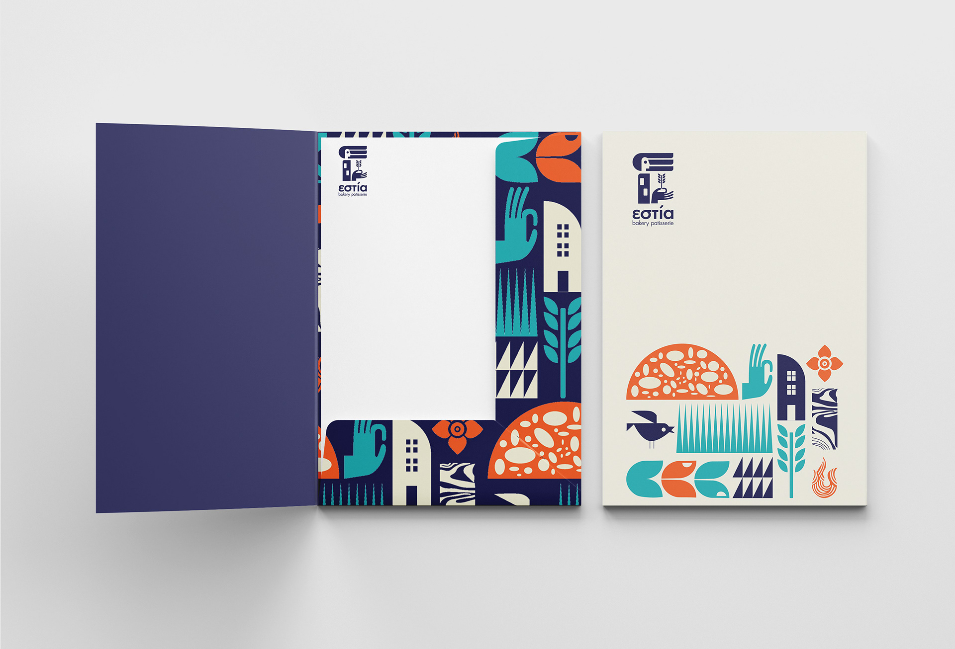
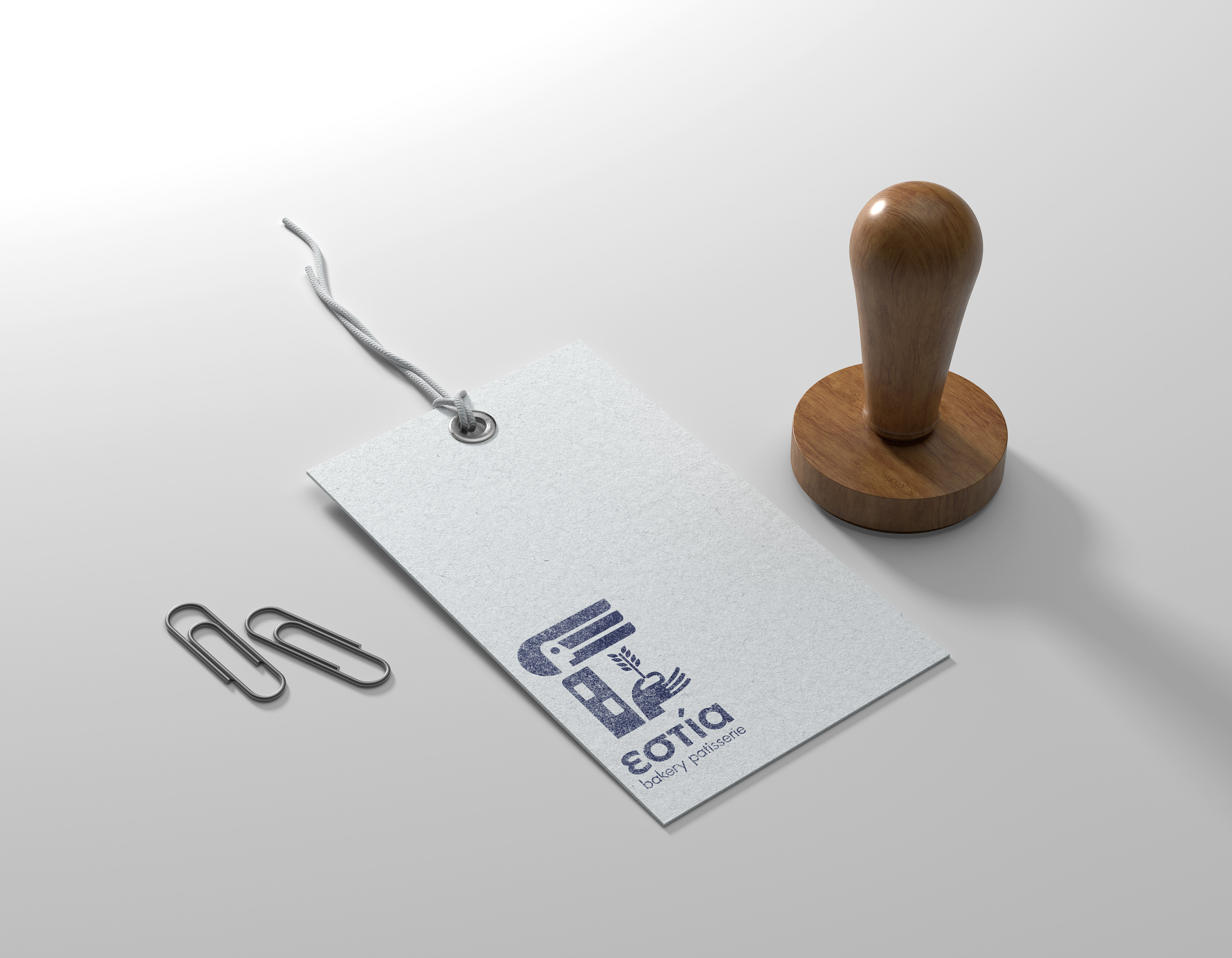
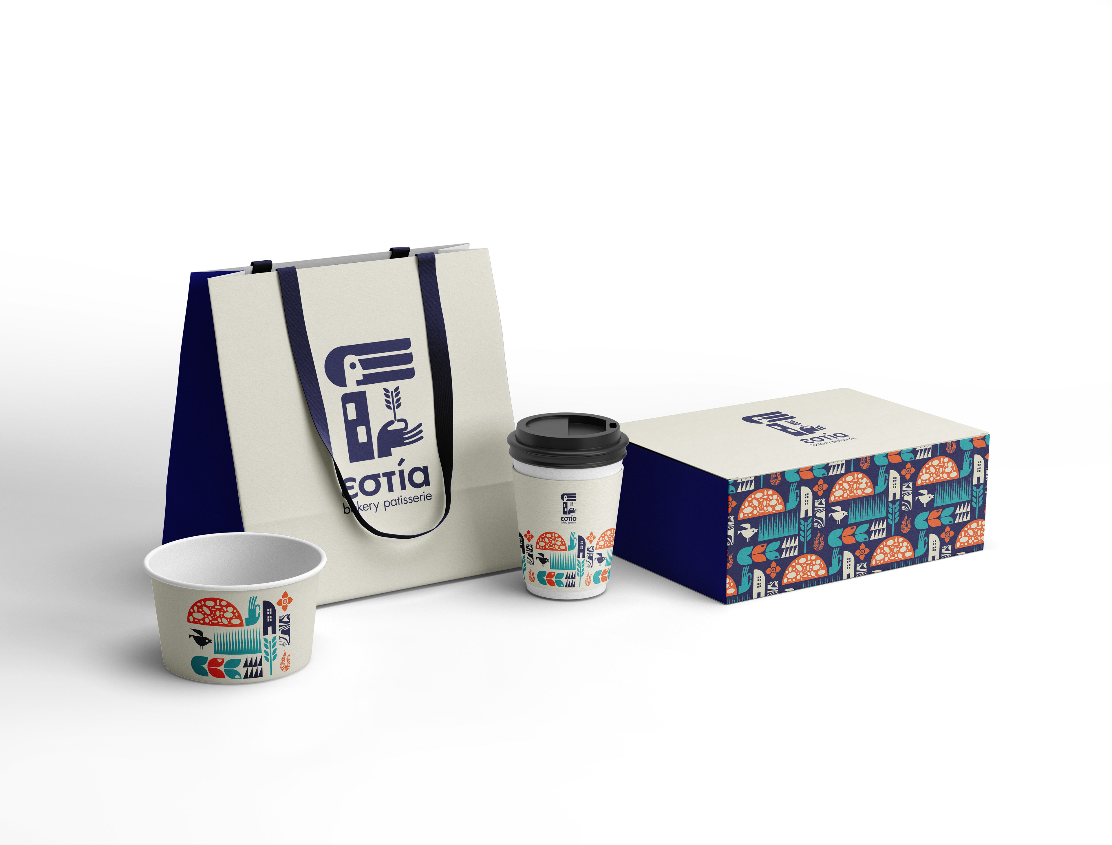
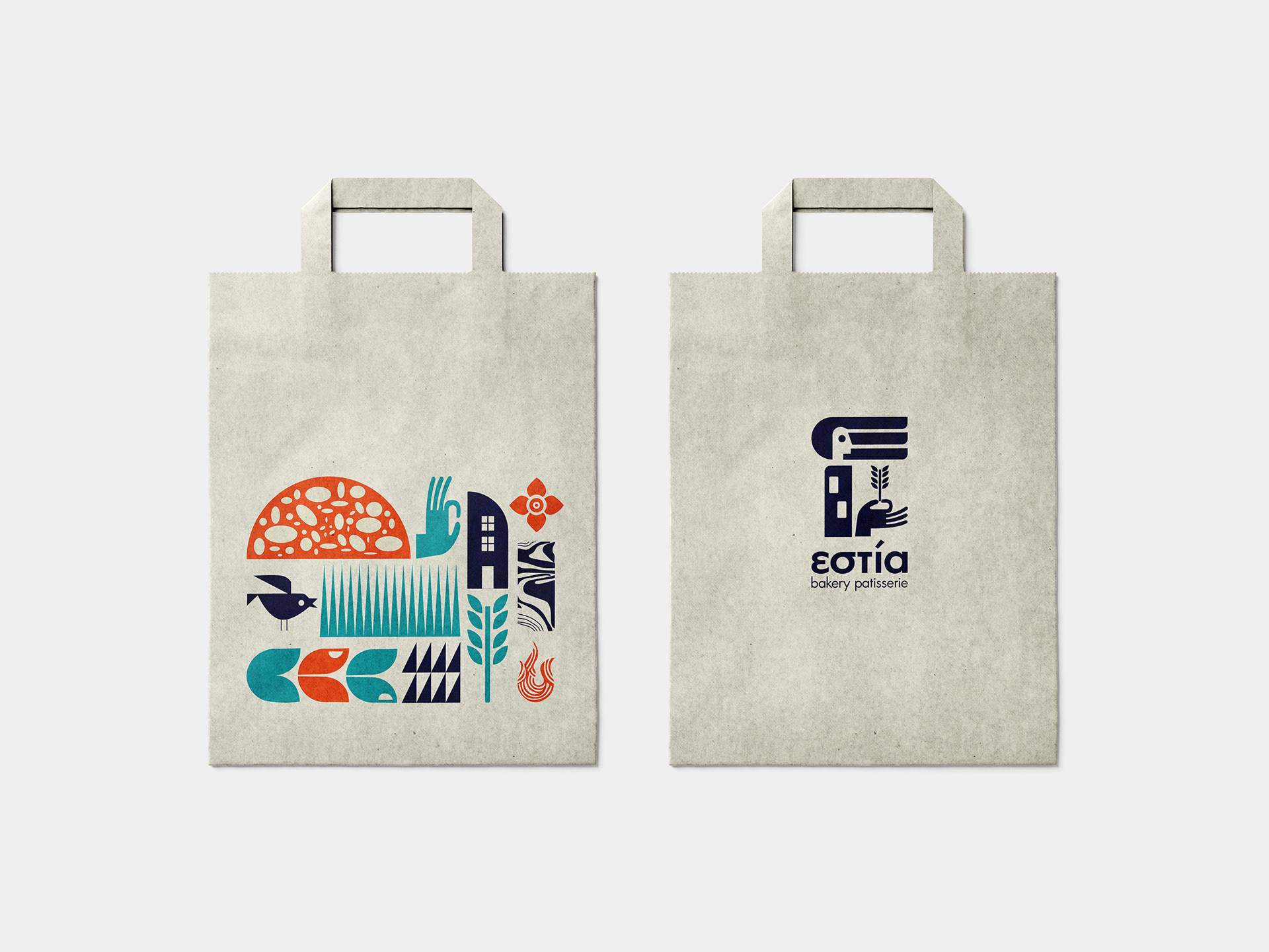
The primary design elements include the portrayal of the goddess's head, represented by the letter "E" adorned with vertical lines. The woman's body is depicted in the form of a rectangular shape, symbolizing the concept of home, while her hand holds the wheat, a widely recognized symbol in the world of bakeries.
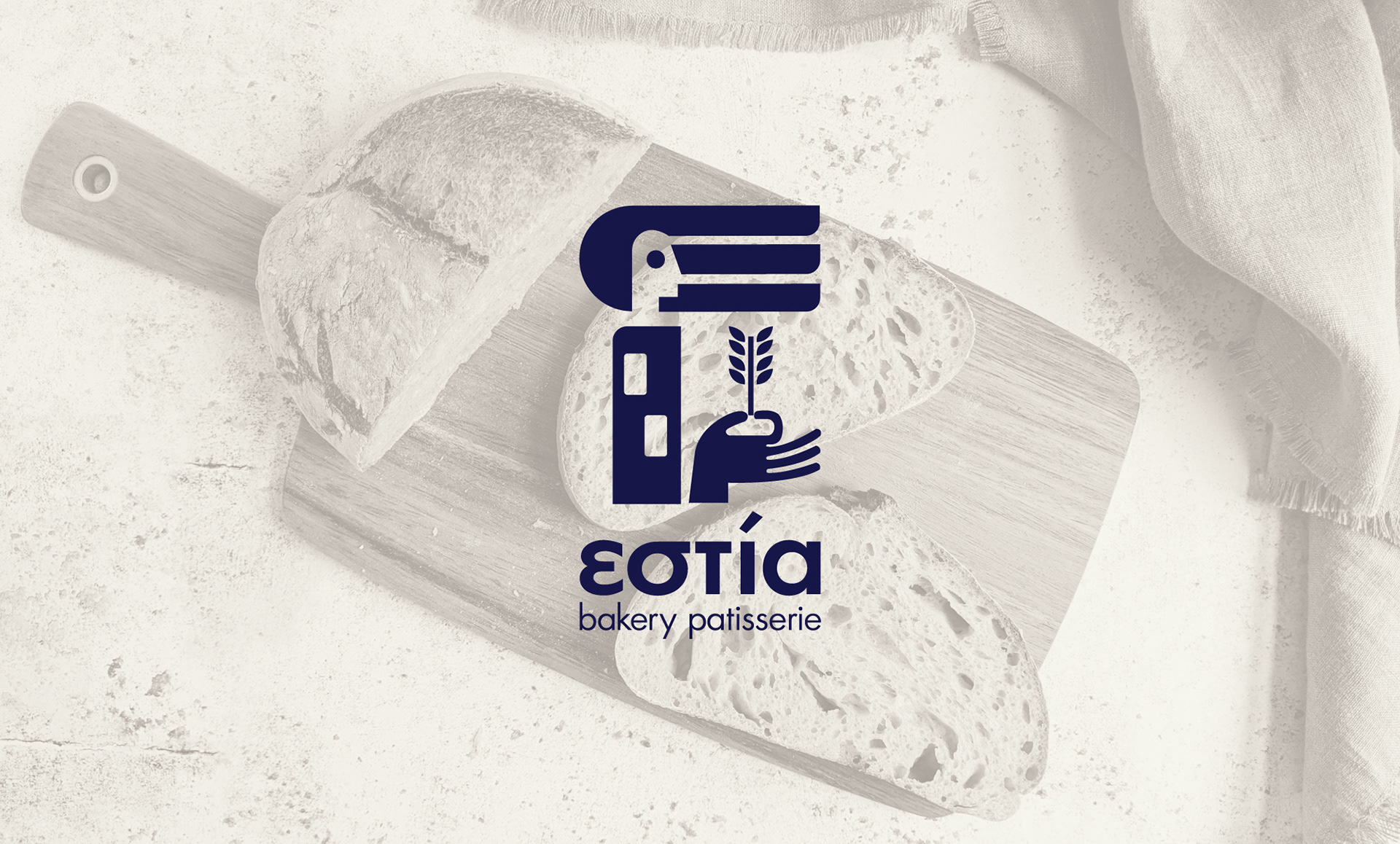
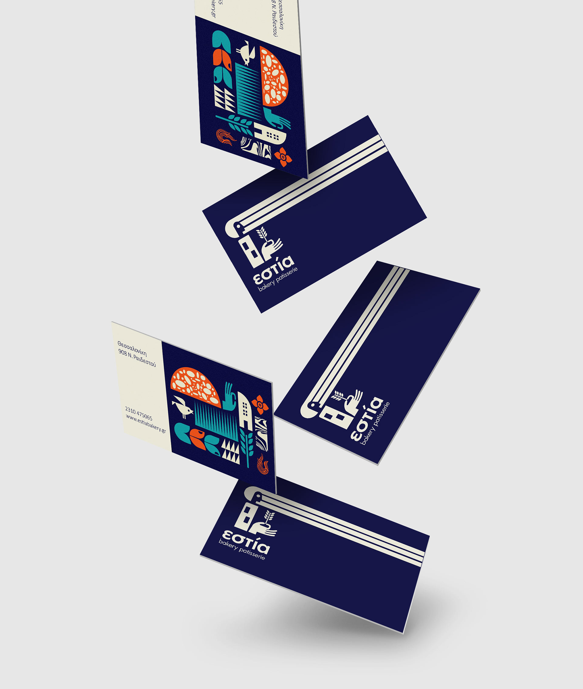
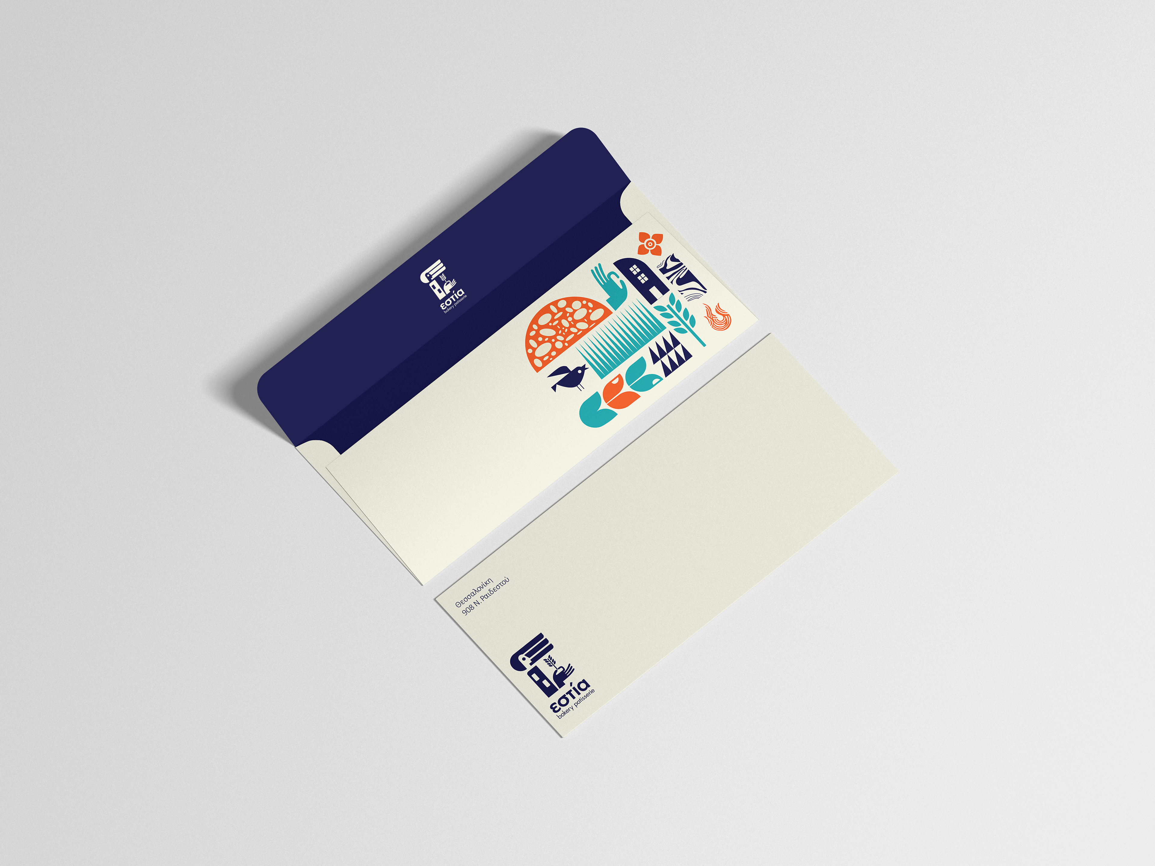
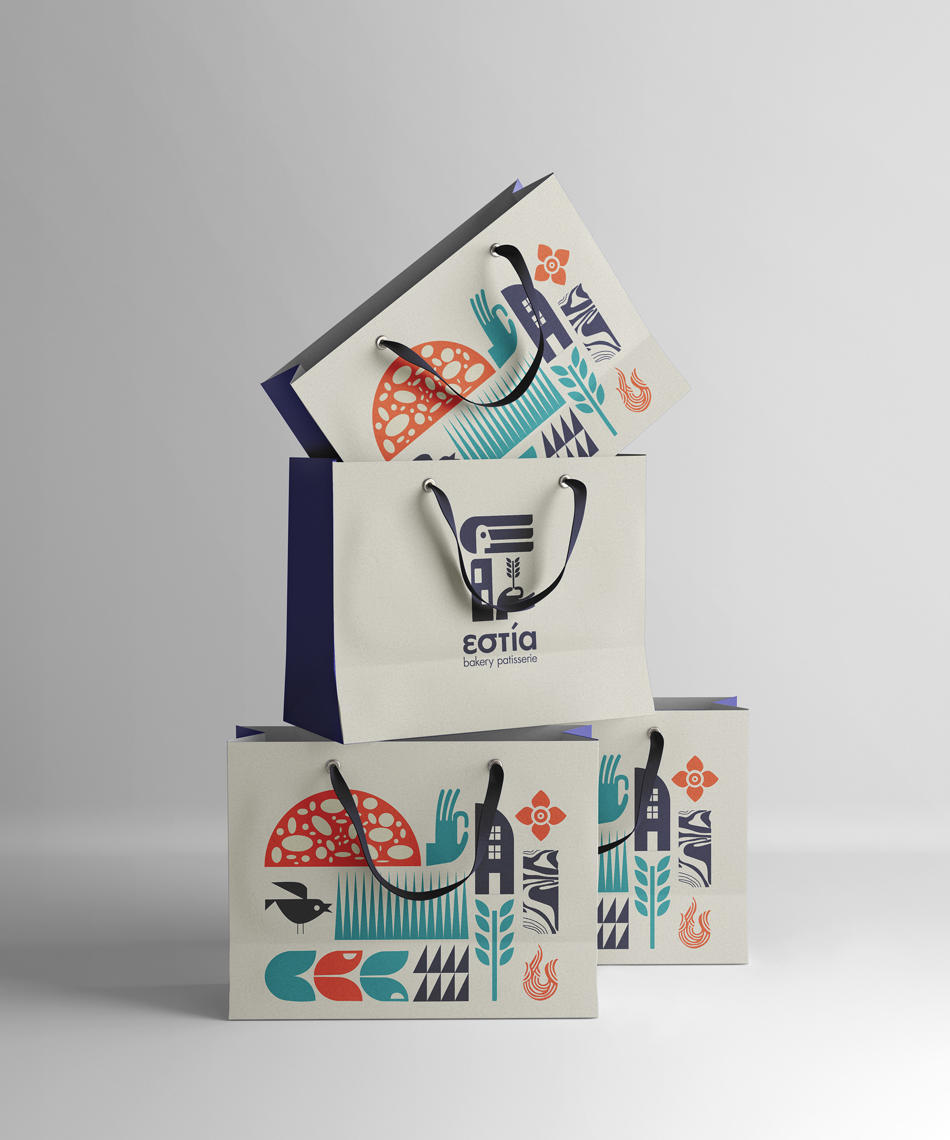
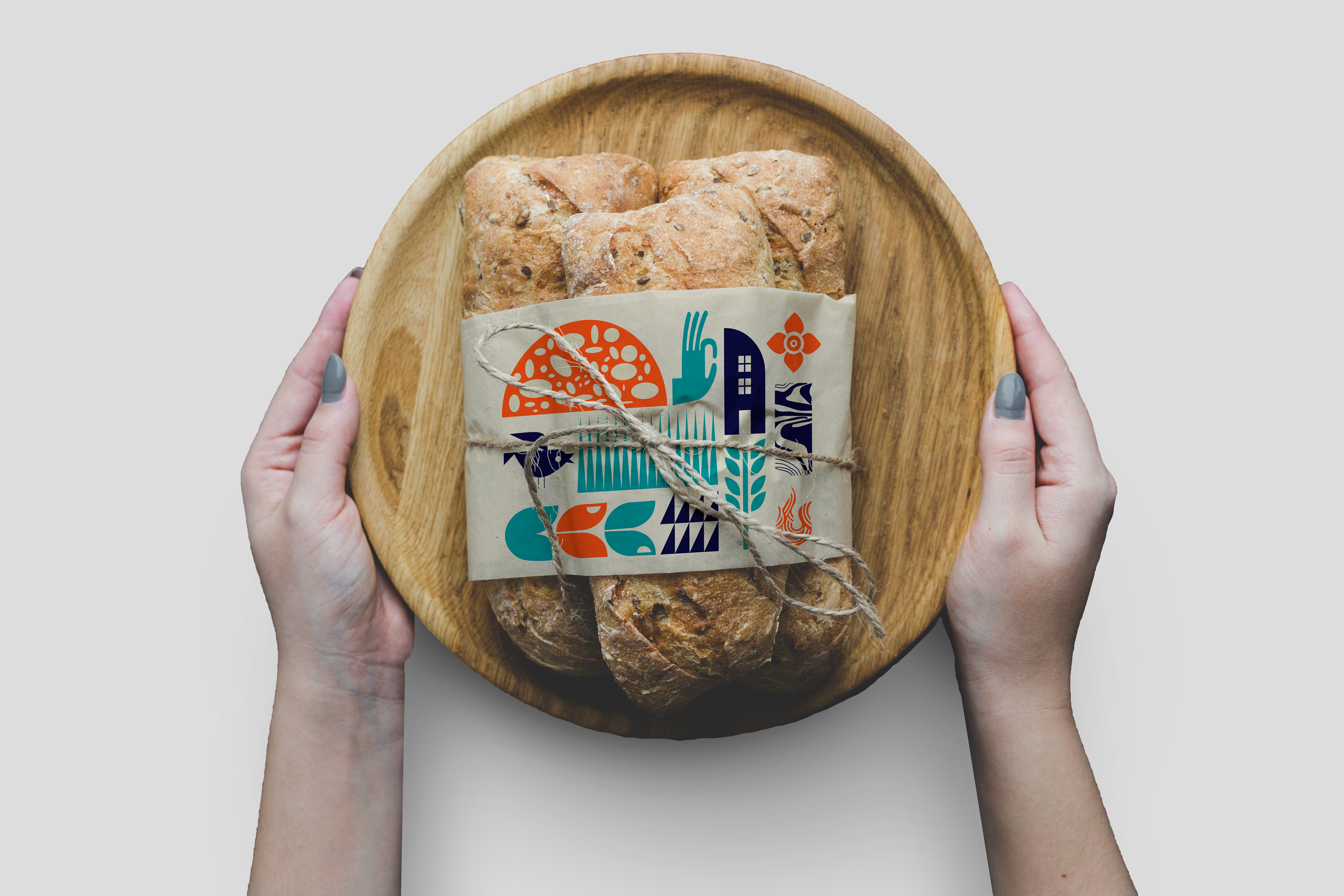
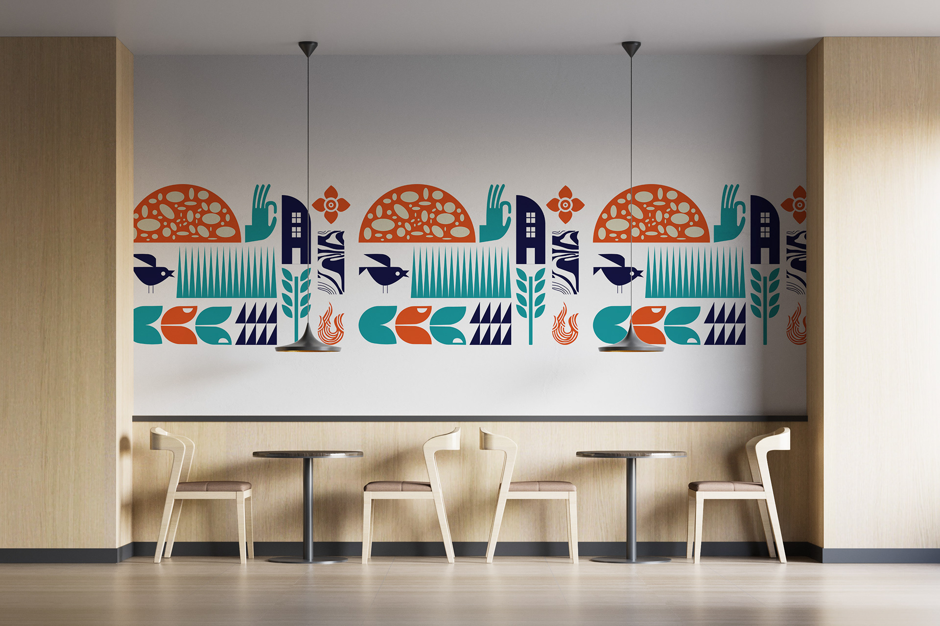
The brand identity and pattern design capture the artistry of bread-making and the warmth of morning rituals. Soft curves and a mix of inviting shapes create a visual language that is both engaging and effortlessly simple, designed to draw the eye and connect emotionally with customers.
A modern aesthetic is maintained through a carefully chosen color palette of red and blue: red evokes warmth, appetite, and energy, while blue brings a sense of calm, freshness, and trust. Together, they reflect the sensory experience of a bakery in the early hours, vibrant, comforting, and full of anticipation.