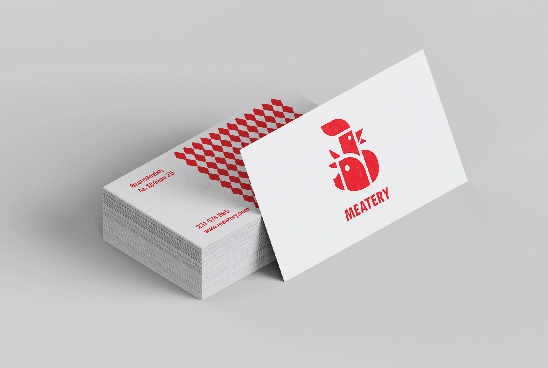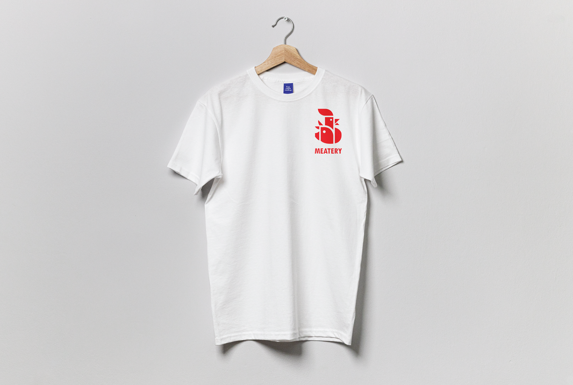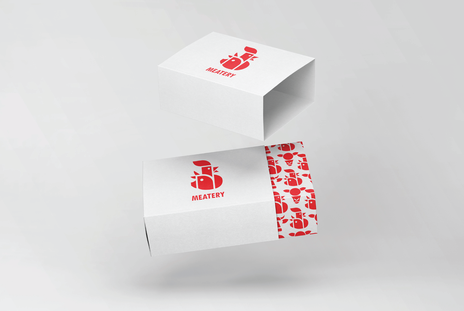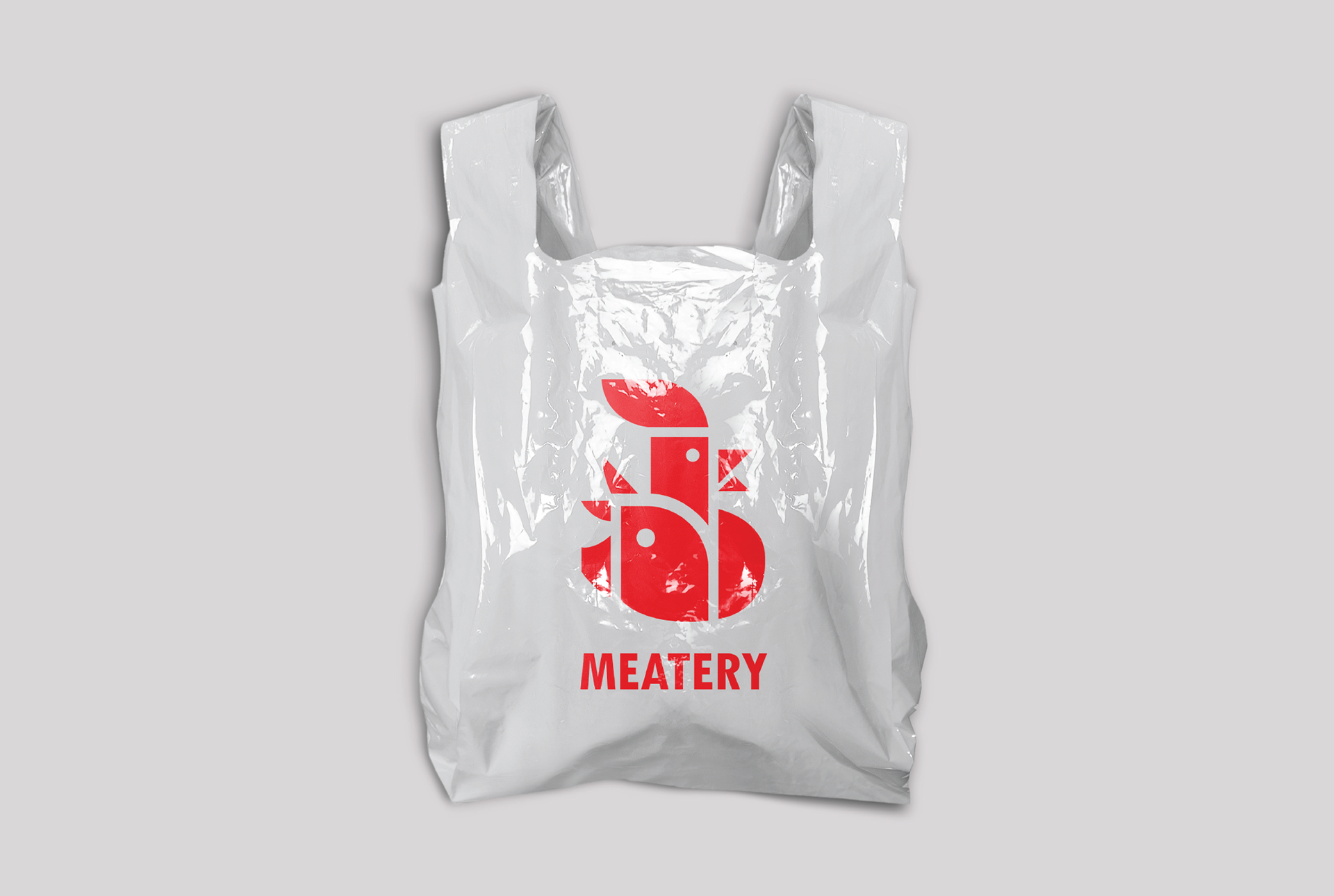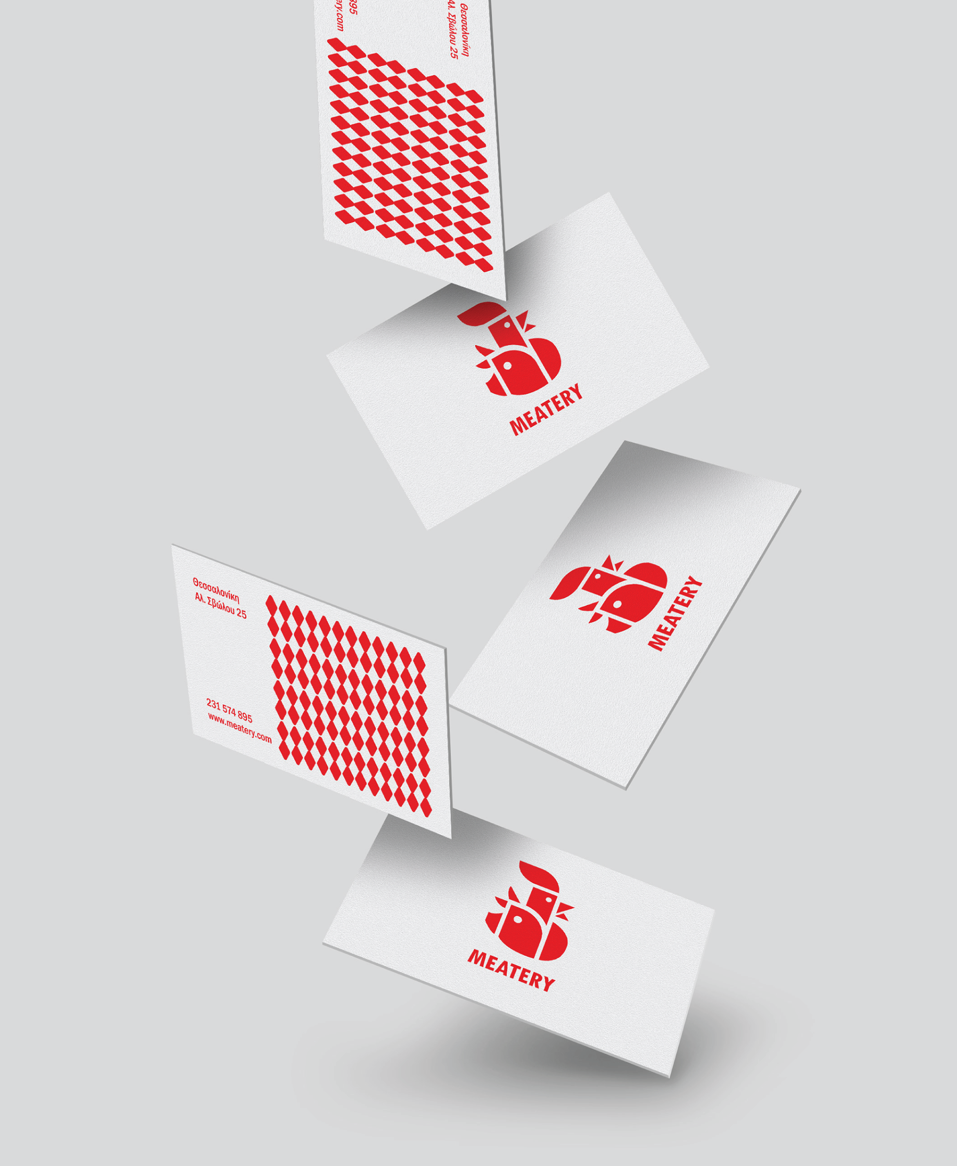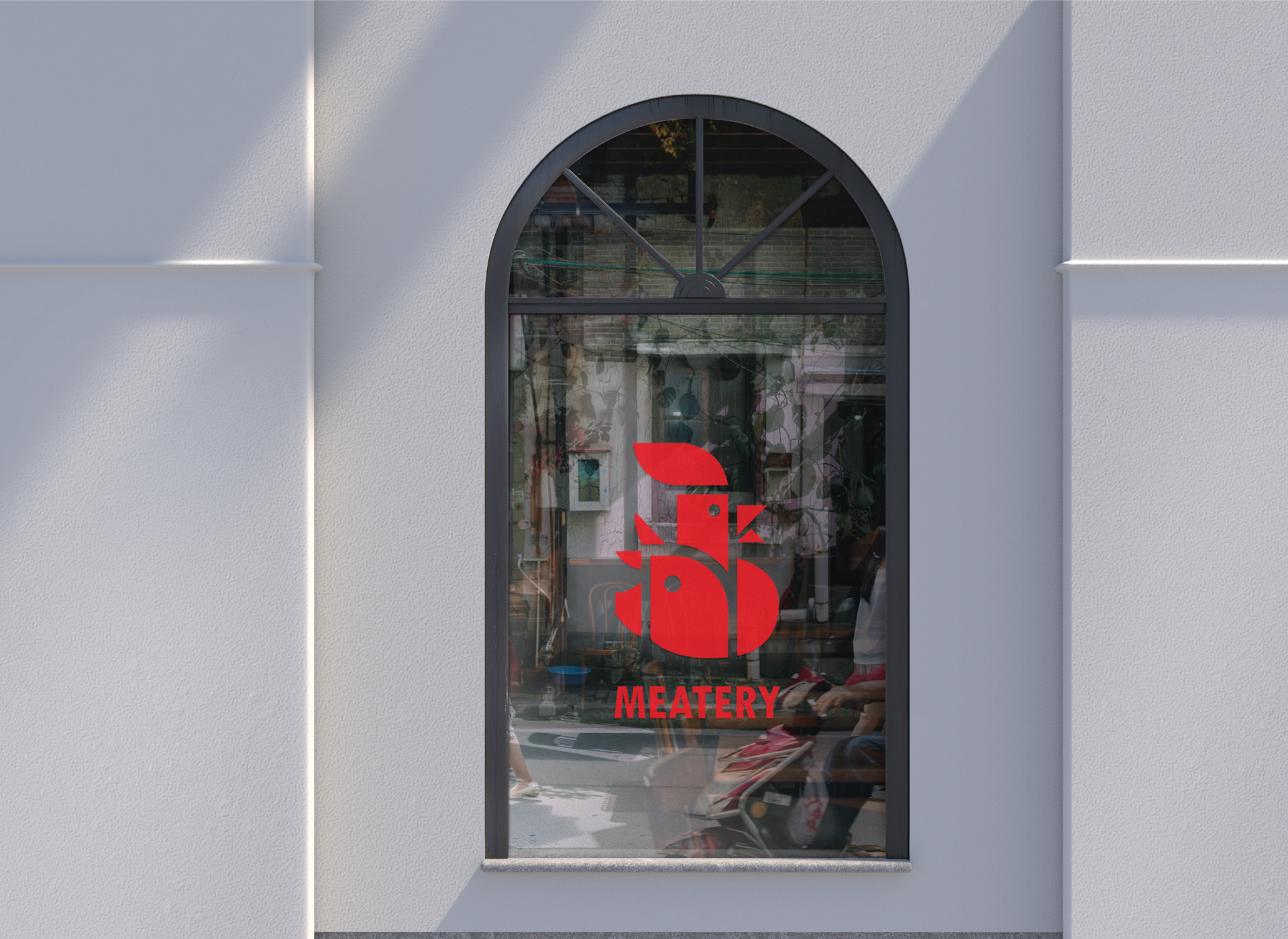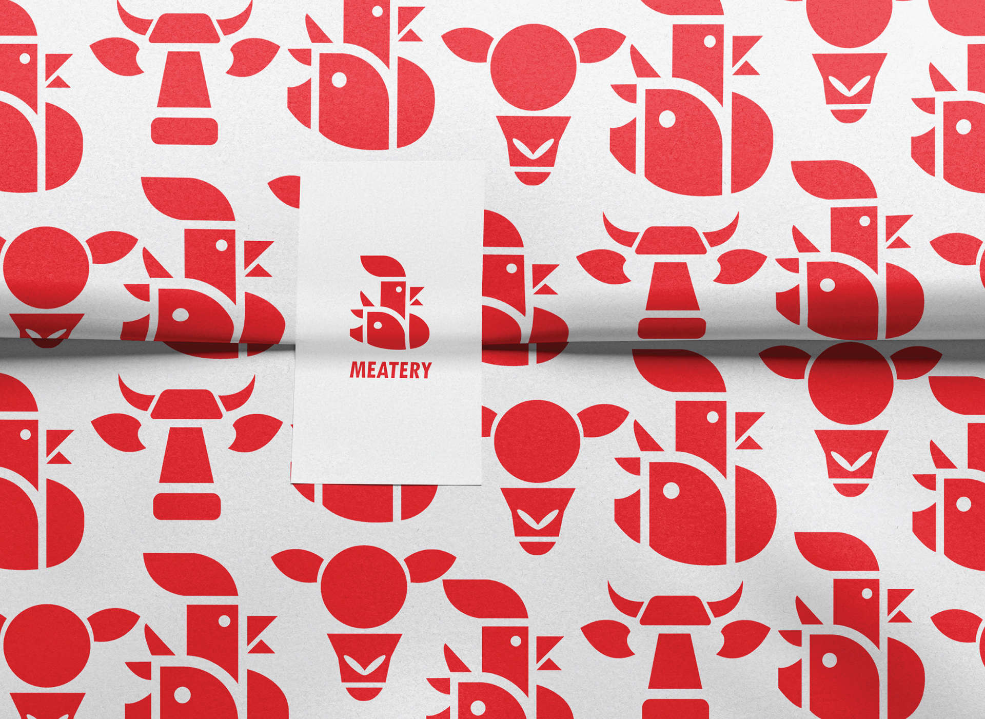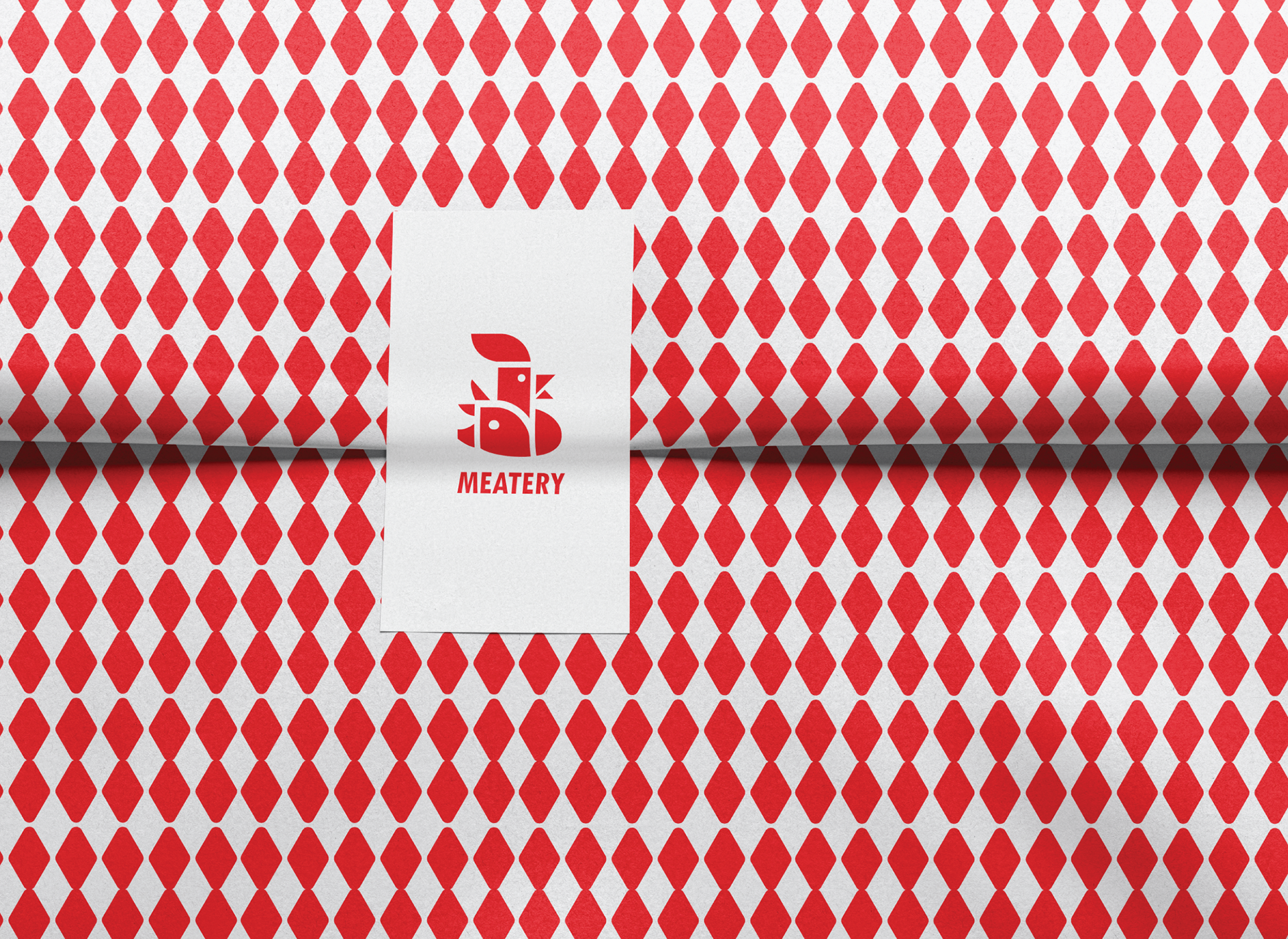
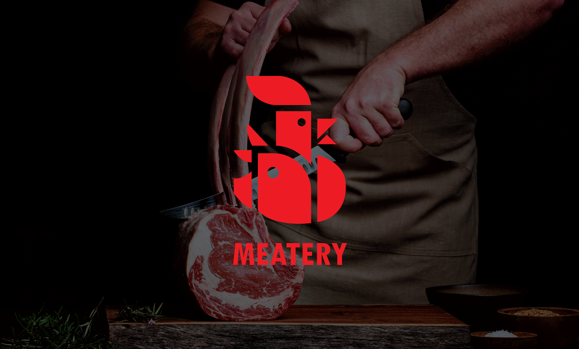
Logo and brand identity for the butcher shop Meatery.
The primary objective of this brand identity was to craft a logo distinguished by its clean lines and modern aesthetic. To achieve this, two animal heads were designed using minimalist geometric shapes and effective negative space.
The use of these refined forms, combined with a bold typeface and a striking red color palette, allows the logo to break away from the traditional butcher shop aesthetic, giving it a distinctive and contemporary presence.

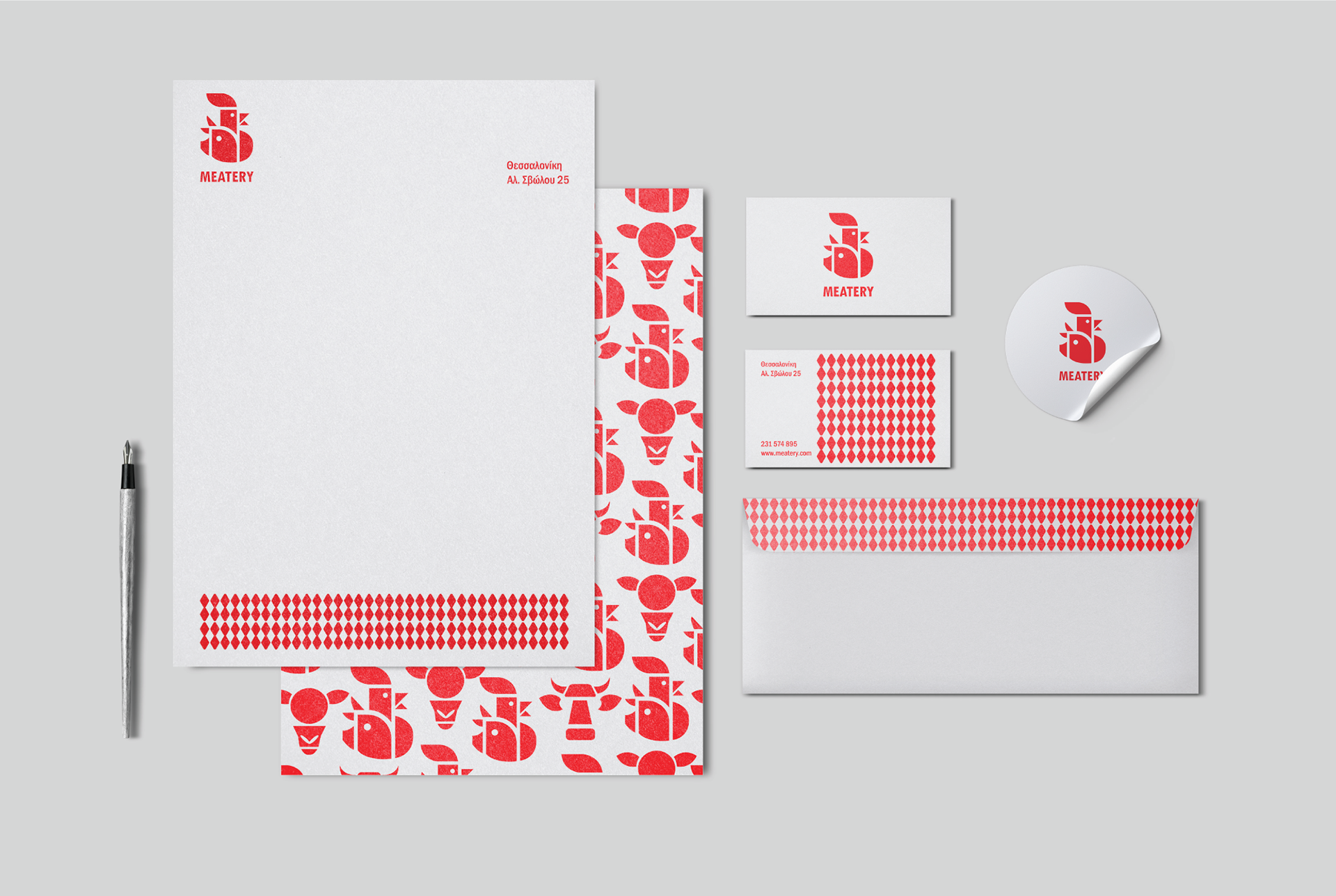
The primary goal of the branding was to create a visual identity that feels premium, modern, and distinctly different, something that instantly communicates quality. The pattern draws inspiration from the unique markings found on the ears of cattle, adding a subtle yet meaningful connection to the brand’s roots and reinforcing its authenticity.